Why Most Shopify Stores Don’t Convert (And How CRO Actually Fixes It)
The Ecommerce CRO Playbook: How Top Brands Turn Traffic Into Sales Lessons from Momentous, Burrow, Graza, and the frameworks behind their highest-converting pages
Stop Guessing Why Your Store Isn't Converting
Most ecommerce brands have enough traffic. What they're missing is a clear understanding of why visitors aren't buying — and a system to fix it. Bad product pages, weak offers, unanswered objections, and a checkout that leaks at every step. These aren't traffic problems. They're conversion problems. And they're fixable. Let's look at exactly what's holding your store back and build a plan to fix it.
Most ecommerce brands obsess over traffic. They pour money into paid ads, influencer partnerships, and SEO then watch the majority of those hard-won visitors leave without buying. The uncomfortable truth is that getting people to your site is only half the battle. What happens after they arrive determines whether your marketing spend turns into revenue or evaporates.
That's what Conversion Rate Optimization (CRO) is about. It's the discipline of making your store work harder for every visitor you already have by improving layouts, copy, trust signals, checkout flows, and a hundred other variables so that more browsers become buyers. And when it's done well, the results are dramatic.
This article breaks down the data behind CRO, looks at the real-world tactics used by some of the most conversion-focused brands in ecommerce, and explains why investing in CRO is one of the highest-ROI decisions a growing store can make.
01Where CRO Matters Most: Key Metrics You Can’t Ignore
Average Conversion Rates
The average ecommerce conversion rate in 2025 sits between 2% and 4%, depending on the industry, device, and traffic source. That means for the typical store, 96 to 98 out of every 100 visitors leave without purchasing.
Top-performing stores consistently hit 4–5% and beyond. A conversion rate above 3% puts a store comfortably among the best-converting online stores. A conversion rate above 4.8% puts you in elite territory. The gap between average and elite isn’t just luck but it’s the result of deliberate, systematic optimization.
The financial logic is compelling. If you’re driving 50,000 visitors per month and converting at 2%, you’re making 1,000 sales. Lift that rate to 3%—just a single percentage point—and you’re making 1,500 sales from the same traffic. That’s 500 additional transactions without spending an extra dollar on acquisition. Multiply that by your average order value and the math becomes hard to ignore.
Cart Abandonment
Cart abandonment is the single biggest conversion leak for most stores. Cart abandonment rates globally exceeded 70% in 2025, with unexpected costs like shipping fees and taxes cited as the main reason for drop-off in the US market. That’s revenue that was almost yours but with the right CRO interventions, a significant portion of it is recoverable.
Site Speed
Site speed is an often-overlooked lever. Pages loading in around 2.4 seconds converted at 1.9%, while pages taking 5.7 seconds or more converted at just 0.6%. Walmart’s data showed that each one-second improvement in page speed delivered a 2% lift in conversions. Speed is CRO.
Mobile Experience
Mobile cannot be an afterthought. Mobile devices accounted for over 62% of global website traffic in Q2 2025, yet desktop still converts at roughly double the mobile rate—4.8–5% versus 1.6–2.9%. Optimizing for mobile is one of the largest untapped opportunities for ecommerce stores today.
What the Best Brands Actually Do
CRO isn't a single tactic. It's a system of continuous cycles of testing, measuring, and improving across every touchpoint in the customer journey. The brands that win at CRO don't stumble into it. They build it into how they operate.
02Eliminating Core Objections

Every product has objections that sit between the customer and the purchase. These are the things they can't get past and the questions that keep them from clicking "add to cart." Most brands ignore them. The brands that convert best have built their entire product page around dismantling these fears and concerns.
This isn't about identifying just one concern. It's about recognizing that customers arrive with multiple objections that are specific to your brand, your claims, and what you're selling. If you market yourself as a healthy product, those objections might be around ingredients or how it's made. If you sell on speed, they might question reliability. If you sell luxury, they might question the material.
Every brand attracts its own set of objections shaped by the promises you make and the expectations those promises create. Get this right and everything else on the page gets easier. Get it wrong and no amount of beautiful imagery, social proof, or urgency tactics will save your conversion rate.
Momentous
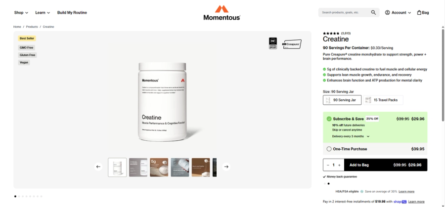
Founded by Jeff Byers Momentous is a perfect example of deilvery on organic content promises. Their core brand promise is built around quality, purity, and expert credibility. On their Instagram and throughout their ad campaign they say
"supplements for those who demand better, NSF Certified, expert-developed, highest quality ingredients."
That positioning is powerful, but it immediately creates a specific set of objections a visitor brings to the product page:
- Is it actually pure? If you're claiming the highest quality ingredients, I want proof of what's in it, where does it come from, and who verified it?
- Is it really certified? NSF Certified is a big claim. Show me the badge, the documentation, and the third-party verification.
- Will it actually work? "Expert-developed" raises the bar. That means I expect clinical backing, not marketing language.
- Is it worth the premium? Positioning yourself as the best invites price scrutiny. Why should I pay more than a generic creatine from Amazon?
These objections aren't generic, they're brand-specific. A budget creatine brand wouldn't face the certification objection the same way because they never made that promise. Momentous made the promise, so Momentous has to answer for it.
Now look let’s look at how the product page responds. It earns its claims rather than just repeating them
Creapure® sourced from Germany, NSF Certified for Sport® badge displayed prominently
This section directly battles the "is it actually as good as you claim?" objection. The headline, the sourcing callout, the NSF certification, and the accordion tabs for Clinical Research & 3rd Party Test Results are all doing one job which is proving the quality promise isn't just marketing. Notice they don't just say "high quality," they show you exactly where it comes from and who verified it.
Customer reviews that specifically call out purity and third-party testing. The FAQ tackles bloating, safety, and efficacy head-on. Even the early testimonials are chosen to address the exact doubts a skeptical buyer would have.
They handle core objections head on.
Burrow
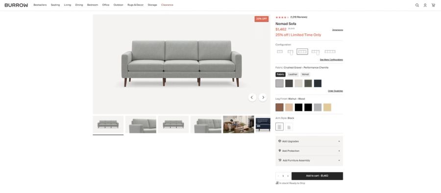
Burrow Is an online furniture company. Burrow's brand promise is built around modern design, modularity, and buying furniture online without the risk. That positioning creates a very specific set of objections and the Nomad Sofa page addresses each one directly.
"Can I trust buying a $1,500 sofa without sitting in it first?" — Free swatches, 30-day returns, and showroom locations. They know this is the biggest barrier to an online furniture purchase so they answer it in multiple places.
"Will it actually last?" — CertiPUR-US certified cushions, PFAS-free fabric, galvanized hardware, precision-milled hardwood. Every material claim is specific, not vague.
"Is online furniture a nightmare to deliver and assemble?" — They flip this into a selling point. Modular design means standard shipping boxes, no freight surprises, and assembly that "intuitively makes sense" as one reviewer put it.
"What if my life changes and the sofa doesn't fit anymore?" — The entire modularity section exists for this objection. Expand it, reconfigure it, add an ottoman later.
Notice what's interesting compared to Momentous, Burrow's objections are almost entirely about the buying experience rather than the product itself. That's because their brand promise is about making furniture buying easier, not just making good furniture. The promise shapes the objections, and the objections shape the page.
Graza
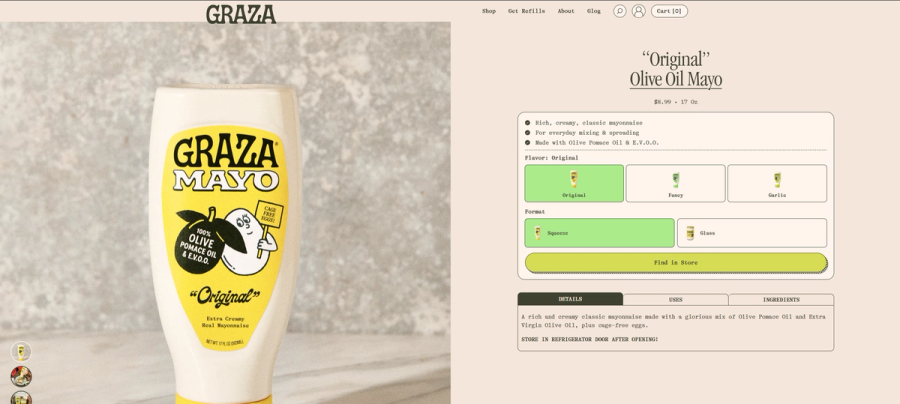
Graza is interesting because their brand promise is built entirely around "oil you can actually trust" with no seed oils, no sketchy ingredients, just good olive oil. That's a bold claim in a category where most people assume all mayo is basically the same junk. So their objections are almost entirely about skepticism and ingredient scrutiny.
"Is this actually different from regular mayo or just marketing?" — The "Us vs Them" comparison table goes straight at this. They don't just say they're better, they line up Graza against regular mayo, avocado oil mayo, and "other mayos with olive oil" and call out the greenwashing happening in the last category specifically.
"What even is olive pomace oil — is that a real thing or a loophole?" — They know this sounds unfamiliar so they address it inline, right on the page, in a casual conversational tone before the customer even has to Google it.
"Is it actually healthier?" — It's literally an FAQ question. They know their health-conscious audience is buying on that premise and needs it confirmed.
"Does it taste good though?" — "Tastes delicious" is a column in the comparison table. For a brand asking you to switch from a comfort food staple, taste doubt is real and they treat it as seriously as the ingredient claims.
What makes Graza's objection handling distinct from Momentous and Burrow is the tone. The objections are the same shape, prove your claims and earn trust, but Graza answers them like a friend in the kitchen rather than a brand making a case. That's deliberate. Their audience is skeptical of polished marketing, so the objection handling has to not feel like objection handling.
Understand Your Core Objections
A core objection isn't "the price is too high", "I'm not sure I need this", or even a money back guarantee. Those are secondary hesitations. Core objections are structurally baked into the product category and how you market your product. They exist for every potential buyer regardless of price point or brand awareness.
Common core objections by category:
- Eyewear — You can't try them on before buying
- Mattresses — You can't feel it before spending $1,000+
- Skincare — You don't know if it'll work for your skin type
- Furniture — You don't know if it'll fit the room or match what you have
- Supplements — You don't know if they're legit or if they'll actually work for you
- Clothing — You don’t know if they’ll fit your body type
Every product category has its version of this. The question is whether your page addresses it directly or hopes the customer will talk themselves out of it.
03Proving Quality Through Visuals
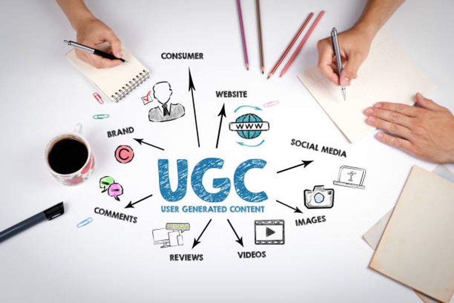
One of the most repeated pieces of advice in DTC is this: 99% of brands that think they need a CRO agency just need better images and UGC. Because seeing is believing.
This matters because no amount of copy can do what a great visual can. You can write "dissolves completely with no clumping" or you can show a crystal-clear glass of water with a scoop of creatine disappearing into it. You can write "stands up to everyday family life" or you can show a kid jumping on the sofa with the dog. The image does the work faster, more convincingly, and without asking the visitor to trust your word for it.
This is why visuals aren't a design decision, they're a conversion decision. The right image at the right moment on a page can answer a Core Objection before the customer even consciously registers they had it. The wrong image is generic, staged, low quality, or simply irrelevant and leaves that objection sitting there unanswered, quietly killing your conversion rate.
There are two types of visuals that do this job best. Brand photography sets the tone and signals quality. Then there is UGC real customers, real environments, real use which provides proof. Both matter, but they do different jobs.
Brand photography says "this is what we stand for."
UGC says "this actually works, and here's someone like you to prove it."
Together they form a visual argument that no bullet point list can replicate. The brands that get this right don't just have pretty pages. They have pages where every image is earning its place by answering a question the customer was already asking.
How to Fix Your Visual Problem
The good news is that getting great visuals has never been more accessible. You don't need a $50,000 photo shoot or a full production crew. You need the right tools and a system for collecting proof.
Better Product Photography
AI Product Photography Tools like Pebblely, PhotoRoom, and Claid.ai let you take a basic product shot on your phone and place it into a professional-looking scene in minutes. For brands just starting out or testing new angles, these remove the cost barrier entirely. They won't replace a full brand shoot but they'll get you significantly further than a white background jpeg.
Affordable Studio Setup If you want to shoot yourself, the investment is smaller than most brands think. A lightbox, a cheap sweep backdrop, and a modern smartphone camera will outperform a DSLR with bad lighting every time. Apps like Lightroom Mobile handle the editing. The bottleneck is almost never the camera but it's the lighting and the context.
Hire on Fiverr or UGC Platforms Product photographers on Fiverr can produce clean, on-brand imagery for $50–$200 per shoot. For lifestyle photography specifically, platforms like Backstage and JoinBrands connect you with creators who will shoot styled content with your product in real environments.
Farming Better UGC
UGC doesn't happen by accident. The brands with walls of authentic customer content built a system to generate it.
Make it easy to submit. Most customers who love your product never share it because nobody asked. A simple post-purchase email sequence — sent at the moment they're most excited, which is day two or three after delivery — asking them to share a photo or video converts surprisingly well. Tools like Okendo, Yotpo, and Stamped let you automate this and pull it directly into your reviews.
Incentivize without bribing. Discounts on the next order, loyalty points, or early access to new products give customers a reason to share without making the content feel paid for. The moment UGC feels transactional it loses the authenticity that makes it valuable.
Run a seeding program. Send your product to micro-influencers and everyday customers with no strings attached just a genuine ask for honest feedback and content if they love it. Tools like Roster and Gatsby help you identify your existing customers who already have social followings, which means the content comes from people who already chose to buy you.
Use your packaging. A card in the box with a QR code, a hashtag, and a simple ask is one of the most underused UGC tactics in DTC. The customer is holding your product at peak excitement and that's the moment to capture it.
Repurpose reviews into visual briefs. Read your best written reviews and turn them into creative briefs for UGC creators. If five customers mention that your creatine dissolves perfectly in coffee, brief a creator to shoot exactly that. The best UGC isn't random but it's engineered to visually answer the objections your reviews tell you people have.
04The Offer

The offer is not the product. The product is what you make. The offer is what the customer believes they are getting and those two things are rarely the same.
The offer has two parts that work together. The first is the promise: the transformation, outcome, or identity the customer is buying into. The second is the commercial structure: the price, deal, guarantee, or bundle that makes acting on that promise feel like a smart decision right now.
Neither works without the other. A compelling promise with a friction-heavy commercial structure leaves money on the table. A great deal wrapped around a weak promise attracts the wrong customers and drives returns. The best converting pages nail both.
The Promise
The promise is the answer to the question every customer is silently asking: "What does my life look like after I buy this?" It's not a list of features or ingredients. It's the outcome those features produce.
Momentous doesn't sell creatine. They sell the confidence that you're putting the cleanest, most clinically backed supplement available into your body. Graza doesn't sell mayo. They sell the feeling of cooking with ingredients you're actually proud of. Burrow doesn't sell a sofa. They sell the version of furniture buying that doesn't end in regret.
When the promise is clear, customers aren't comparing your product to competitors on specs. They're deciding whether they want the outcome you're describing.
The Commercial Offer
This is where most brands leave conversion rate on the table. The commercial offer is everything around the transaction that makes saying yes feel easier and saying no feel riskier.
The levers you have are straightforward.
Price anchoring — showing the original price alongside a sale price will make the current deal feel like a win.
Subscription models with a meaningful discount, like Momentous's 25% off, convert browsers into long-term customers while increasing lifetime value.
Guarantees — money back, free returns, satisfaction promised — remove the risk of being wrong.
Bundles increase average order value while making the customer feel like they're getting more for less.
Threshold offers like free shipping over $75 nudge basket size up without feeling pushy.
The key is that the commercial offer should feel like it reinforces the promise, not undercut it. A brand positioning on premium quality running a permanent 40% off sitewide sale is sending mixed signals. The deal should make the decision easier, not make the customer wonder why the margin is so generous.
05How User Experience Affects CRO

Up to this point we've been in the architectural layer which focused on understanding objections, building the right offer, proving quality visually. That foundation matters. But none of it converts if the experience around it is broken.
This is where simplicity becomes your most important design principle. Above the fold should be clean, focused, and direct with one clear path to the product, one clear CTA, no competing distractions. Not three popups fighting for attention the moment someone lands. Not a journey through five pages before they can check out. Just a frictionless line between the customer's intent and your Add to Cart button.
Once that principle is in place, these are the pillars worth testing systematically.
Product Page Optimization
High-quality imagery, detailed descriptions, well-placed CTAs, reviews, and UGC work together to eliminate the objections we covered earlier. If any one of these is weak, the others have to work harder to compensate.
Checkout Flow Simplification
Every additional step in checkout is a place where customers can change their mind. Minimize steps, surface all costs early so there are no surprises at the final screen, and offer multiple payment options including buy now pay later.
Mobile Experience
More than half of your traffic is likely on a phone. Navigation, single-tap checkout, image load times, and button sizing all behave differently on mobile and need to be tested independently from desktop.
Social Proof and Trust Signals
Reviews, UGC, trust badges, and certifications need to appear at the moments of highest doubt not just in a reviews section at the bottom of the page nobody scrolls to.
A/B Testing as a Culture
None of the above is a one-time fix. The brands that compound their conversion rate over time treat testing as a permanent practice, not a project with an end date.
06The ROI Case for Investing in CRO
CRO is a compounding business investment. Every improvement in conversion rate increases the ROI of paid ads, SEO, email campaigns, and influencer spend. The CRO software market is projected to reach $5.07 billion by the end of 2026. Individual brands have seen significant increases: FSAstore.com increased average sales revenue per visitor by 53.8%, chatbots improved conversions by 27%, and long-form landing pages generate 220% more leads. AI-led personalization can increase conversions 25% year-over-year.
Where to Start
Begin with data, not assumptions. Use analytics tools to identify funnel drop-offs. Priority order for most ecommerce stores:
- Fix site speed first — slow pages lose conversions.
- Audit your checkout flow — surface costs, reduce fields, add digital wallets.
- Improve mobile UX — test the purchase flow on mobile. Prioritize above the fold CTAs
- Optimize high-traffic product pages — better imagery, social proof, CTAs.
- Implement abandoned cart recovery — automated emails sent within 1–3 hours.
- Begin A/B testing — start small, measure, and build a testing culture.
Brands winning at CRO are systematic, data-driven, and focused on removing friction. Compounding returns make it one of the most valuable investments a growing ecommerce brand can make.
07Final Tip: Start By Stealing Like a Scientist
If you're still unsure where to begin with CRO, don't start with your own page. Start by studying brands that are already winning.
The key here is to look at your relative competitors, not the national giants with nine-figure budgets, but the mid-size brands that aren't household names yet are clearly doing well in sales and presentation. These are the most useful benchmarks because their wins are replicable. They're working with similar budgets, similar audiences, and similar constraints to you.
Tools like TrendTrack and PPSpy can help you identify who these brands are and get a signal on what's working for them commercially. Once you have a list of 20 to 50 competitors, go through them one by one and take note of everything they're doing right from their above the fold layout, their offer structure, how they handle objections, what their imagery looks like, and where they place social proof.
Then take it a step further. Copy their product page content into your AI chatbot of choice and ask it to extract exactly what they're doing and why it works. Use it to reverse engineer their strategy and identify how you can apply the same principles to your brand. You're not copying anyone, you're learning from a market that has already done the testing for you.
The best CRO insight rarely comes from a framework. It comes from paying close attention to what's already converting.
Frequently Asked Questions
What is CRO and why does it matter for ecommerce?+
What is a good conversion rate for ecommerce?+
What are core objections and how do I find mine?+
Do I need a CRO agency to improve my conversion rate?+
How do I get better UGC without a big budget?+
What should I fix first on my store?+
How is the offer different from the product?+
How do I know if my competitors are converting well?+
Still Need Help Fixing Your Conversion Rate?
Whether it's product pages, abandoned carts, or checkout drop-off — if visitors aren't buying, there's a reason. Let's find it together.