Why Your Shopify Product Page Isn’t Converting (And How to Fix It)
The exact page structure top DTC brands use to turn visitors into buyers A zone by zone breakdown of what actually converts and why What separates the product pages that convert from the ones that don't The page structure behind the brands doing it right Stop guessing. Here is exactly how high converting product pages are built The blueprint behind product pages that actually sell

Want to know how your product page scores?
Click below and we will scan your page zone by zone, show you exactly where you are losing sales, and give you a personalized checklist with the steps and assets you need to fix every issue we find.
You could have the best product in your category. You could be running profitable ads. You could have a growing email list and a loyal community. And your store could still be quietly bleeding conversions because of how your product page is built.
Most ecommerce brands think about product pages the wrong way.
They think about what to include.
They add a gallery, a description, some reviews, a FAQ and call it done.
What they miss is sequence. The order elements appear, the psychology behind where each piece of information lives, and whether the page structure actually mirrors how a real customer moves from landing cold to adding to cart.
This guide breaks that down completely. We split the product page into 7 key zones and go through each one in detail. For every zone we show you exactly what needs to be there, why it works, and how real DTC brands are doing it. Everything in here you can take and apply directly to your own store.
610CRO Won't Save a Broken Foundation
Before we get into the zones, there are two things that need to be in place before CRO can do anything for you. No amount of page optimization will save a brand that has not figured these out first.
1. Brand Identity
Your brand identity is the backbone of every word of copy on your product page. It is what makes you specific. That specificity can be who you talk to, what you stand for, the quality of what you make, the community you have built, the problem you solve better than anyone else. It does not matter what it is as long as it is real and it is clear. Without it you have no foundation to write from and no reason for a customer to choose you over the next option.
2. Price
You need to be selling your product at a price that either competes in the market or is backed by enough brand identity to justify sitting above it. If you want to charge more than your competitors, the marketing, the copy, the ingredients, the trust signals and the overall perceived quality need to earn that price. If they do not, no CRO framework in the world will fix your conversion rate because the problem is not your page, it is your offer.
How to fix the foundation?
The best thing you can do here is study your competitors closely. Look at how they are pricing, how they are structuring their pages, what is working for them. Build your brand within an ecosystem you have already researched so you know how to position and price yourself within it.
A good rule of thumb is this: If there is no product like yours at your price point already selling, then rethink your price point.
If there is no premium organic paper towel brand selling at four times the price of a standard roll, do not start an organic paper towel brand thinking people are gonna pay 4x more. Marketing is not just about what you are selling. It is about what the market cares about and are they willing to pay for it.
According to the Baymard Institute, poor product page design and unclear value proposition are two of the most significant barriers to purchase in ecommerce. If the value is not clear before the visitor scrolls, the page cannot save you.
Many brands that fail at CRO are not failing because of their page. They are failing because:
- They are selling a product for more than its perceived value
- They are selling a product people can find on Temu.
These stores fail because they have not done the work to differentiate themselves. You differentiate yourself with:
- Product photography
- Material & Ingredients
- Page Quality
- Certifications
- UGC
- Target Audience
- Reviews
- Awards
- Perceived Value
You are not special. High prices and lazy product pages are only earned through great organic marketing, genuine quality, and real word of mouth. If you do not have that yet, or you are not selling to a warm niche audience that already knows you, then you have to compete. Everyone does.
Get those two things right first. Then the zones below will actually work.
611The 7-Zone Framework: What every high-converting product page has in common
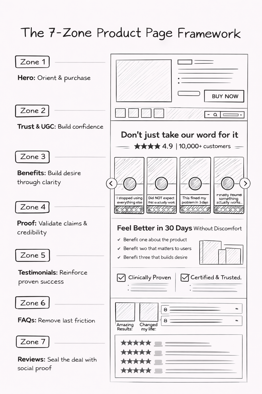
Every high performing DTC product page regardless of product category, price point, or brand size, is built around the same seven zones. The difference between a page that converts and one that does not is almost never whether the zones exist. It is whether they appear in the right order, and whether each one does its specific conversion job without trying to do someone else's.
Zone 1: The Hero Zone
Answer five pre-purchase questions before the visitor scrolls. Orient, legitimize, and make the path to buy obvious.
Zone 2: The trust bar and UGC.
Reset the visitor's receptivity. Before you talk about yourself, have someone else vouch for you. Make them lean in rather than lean back.
Zone 3: Benefit blocks. Build desire through clarity.
Explain what the product does, in outcome language, framed as a story where the product is the hero.
Zone 4: Proof section. Validate the claims just made.
Clinical data, certifications, manufacturing credibility, ingredient transparency.
Zone 5: Result-based testimonials.
Show the transformation in action. Real customers who got the result the visitor wants. Specific, outcome-focused, diverse.
Zone 6: Objection FAQ. Remove the last friction.
Answer the specific questions that stop people clicking Add to Cart with every answer embedded on the page, not linked out.
Zone 7: Review section.
Seal the deal at the bottom. General star-rated reviews for visitors who need that final layer of validation before committing.
The sequence matters because it mirrors the customer's psychology. A visitor arriving cold needs to be oriented before they can be persuaded. They need to understand the product before they can evaluate the proof. They need to want the product before they will trust a FAQ. And they need to be fully sold on the core product before a cross-sell or upsell will land rather than distract. Build the page in any other order and you are interrupting the very journey you are trying to facilitate.
612ZONE 1: The Above the fold
The above the fold hero zone is your highest-stakes real estate. It is the first and only thing a visitor sees before they decide whether to keep reading or leave. On mobile this is where the majority of DTC traffic lands and you have roughly 600 pixels of vertical space to make a complete first impression. On desktop you have more room, but the principle is the same: before a finger or mouse wheel moves, the visitor should already know whether this page is worth their time.
The biggest mistake brands make with the hero zone is thinking about it as a product display. It is not. It is an answer machine. Before a visitor will scroll, they need five questions answered. Your hero zone design should be engineered entirely around those five questions.
The six questions your hero zone must answer
What is this product?
The name, format, and a one-line descriptor that tells a cold visitor exactly what they are looking at.
Is it legitimate?
A credibility signal visible before any copy is read. Review count, awards, media logo, doctor endorsement this something that says this is real and other people trust it.
What does it do for me?
Not what it contains. What it does. Outcomes, not features.
What makes it special?
Ingredients, certifications, sourcing, manufacturing process, the niche you serve, the problem you solve better than anyone else. It does not matter what it is. What matters is that you know exactly what it is and every section of your page reflects it.
What does it cost, and is the price worth it?
Price with context. A strikethrough, a tier, a discount signal, or a per-use calculation that makes the number feel reasonable.
What is the risk of trying it?
A visible guarantee, return signal, or sample mechanic that tells the visitor: if this does not work for you, you are protected.
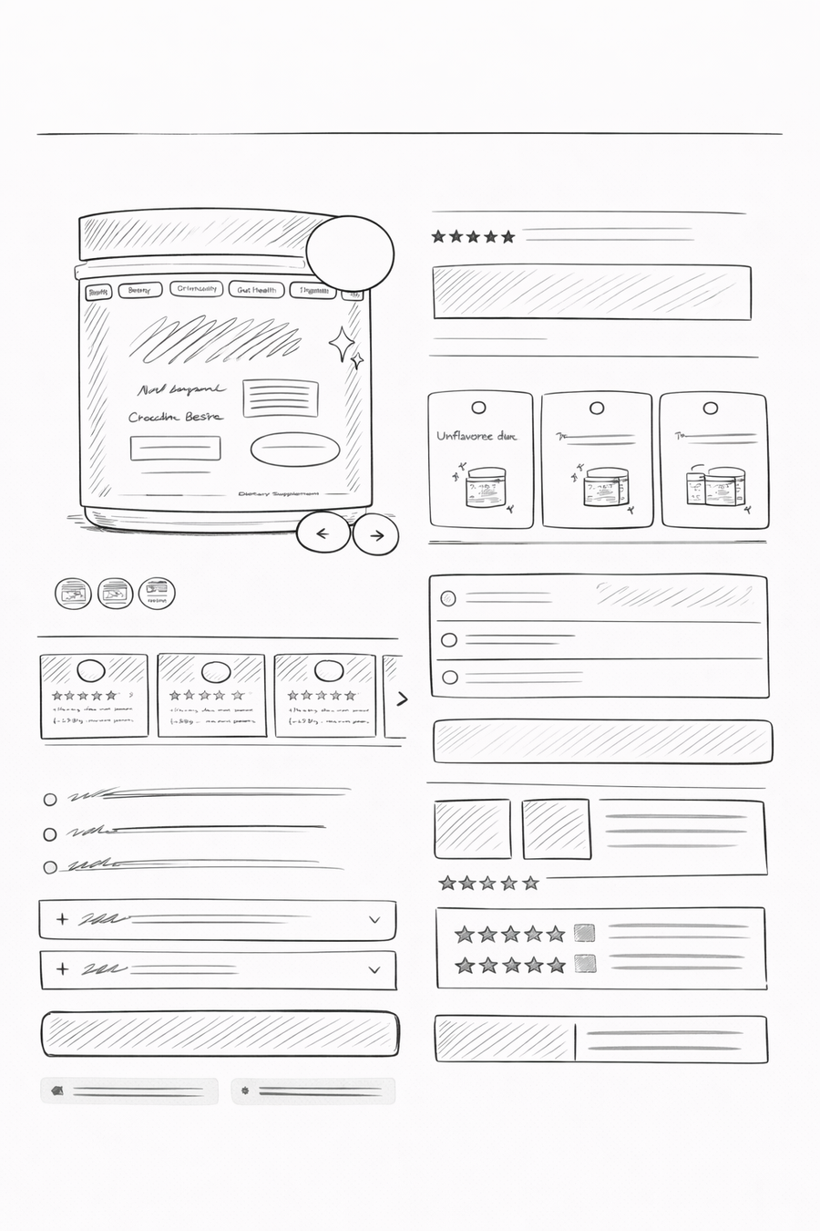
Part one: the above-the-fold block
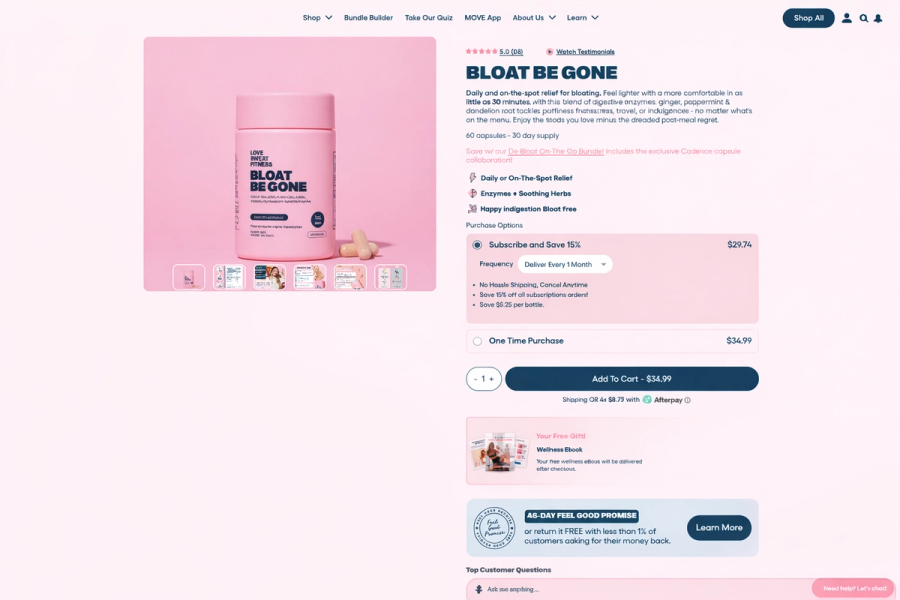
This is the product image, the buy block, the price, the commercial offer, and any quick credibility signals such as review count, badges, risk reversal. Think about this simultaneously for mobile and desktop. On mobile, this is almost entirely vertical: image first, buy block below. On desktop, you have a two-column split with the image gallery left and buy block on the right. Everything in this block should answer the six questions. Nothing else belongs here.
The buy block on the right side of desktop, or below the image on mobile, needs to carry: the product name, a credibility signal such as review count or award badge, the price or commercial offer with any discount context, variant or subscription options, the Add to Cart button, and a brief risk reversal signal. That is the complete unit. All top brands use these elements within this block. None of them waste this space on decorative copy or secondary CTAs.
Part two: the lower hero, where users start to scroll
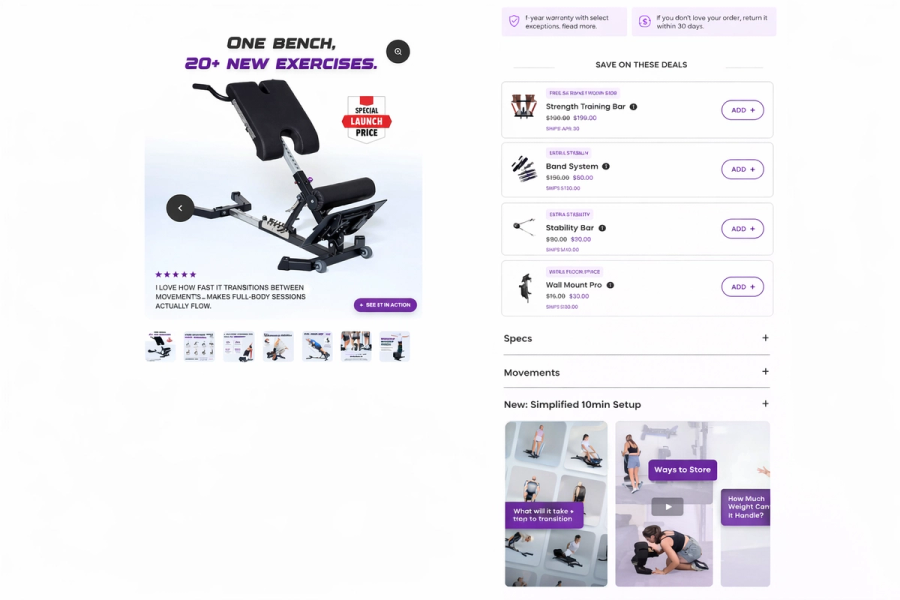
This is the section users enter as they begin scrolling, while the product image gallery is still visible and should be sticky at the top on the desktop, so the image stays in view as they scroll through the details. This lower hero block is where you put the accordion tabs: specifications, shipping details, quick-answer content for the questions buyers have but rarely click on. Seeing you have answered these questions is itself a trust signal. Most people will not expand them. That is fine. The fact that they exist reassures visitors that the brand has thought about their concerns.
The last block inside the hero zone, below the accordion and still within the product header section, is a strategic decision point. You have two strong options, and the right one depends on where your store currently is.
- If conversion is your problem and you believe lack of social proof is the reason, use this space for UGC: a carousel of real customer video testimonials or authentic photo results.
- If you are already converting and you want to grow average order value, use this space for an upsell or a cross-sell to a complementary product.
The goal of this block regardless of which you choose is the same: seal the deal. By the time a visitor leaves the hero zone, they should feel certain they are getting what they want. Check out our interactive carousel below to learn more about Zone 1.
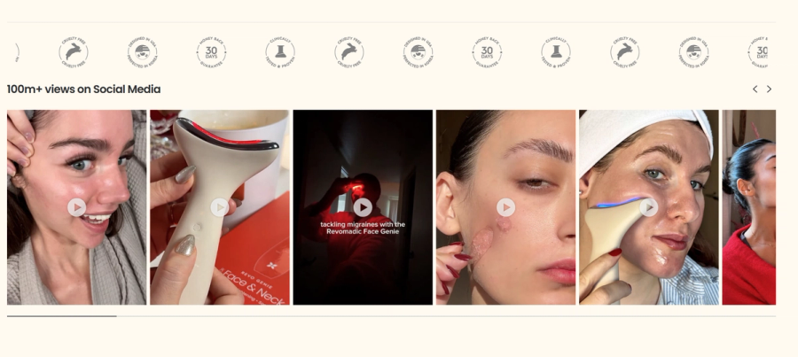
613ZONE 2: The Trust Bar and UGC
Before you talk about yourself, let someone else talk about you.
After the hero zone the visitor has absorbed the basic product information. They have a rough idea of what the product is and have evaluated the costs relative to the market. Now they are starting to decide whether to invest their attention in the rest of the page or leave. They’re still not 100% that the product is legit.
A lot of time in this is the moment brands immediately start talking about themselves. Their formulation. Their values. Their story. And that is a huge mistake because before any of that lands, the visitor needs a reason to listen.
Think about it this way. You're about to meet a real estate agent for the first time. You don't know them, you've got no real opinion either way. You meet them, you form your impression, and then afterwards your friend mentions they know this person and they're great. Cool, that helps a little. But your mind is already made up. First impressions stick. That new information is fighting uphill against a bias that's already been set.
Now flip it. Before you even walk in the door, your friend pulls you aside and says hey, I know this person, they're legit, I've worked with them, trust me. Now you walk into that meeting completely differently. You're open. You're receptive. You're already halfway there before they've said a word.
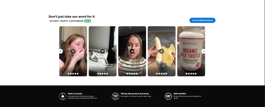
Your product page works the same way. If the first thing after your hero zone is you talking about your product's ingredients or your brand mission, you are asking a cold visitor to receive your self-promotion with an open mind. But if the first thing they see after the hero is a carousel of real customers talking about real results from UGC video testimonials, authentic before/after photos, real people saying this actually worked for me then the visitor's mindset shifts. Now they are more receptive. Now when you do start talking about your formulation and your process, it lands differently, because a stranger has already vouched for you.
This is the job of Zone 2. It is not primarily about proving your product works, that comes in Zones 3 and 4. It is about resetting the visitor's receptivity before you ask them to receive more information.
The most effective format:
- Horizontal carousel of short UGC video testimonials
- Real customers, natural lighting, authentic language,
- Filmed vertically so you can fit more videos into to the scroll experience.
If you do not yet have video UGC, a high-quality carousel of authentic customer photo results serves the same function. But the goal is to show that people buy your brand, they enjoy the product and that the product is real. At this point you are still legitimizing your business to potential buyers and showing is always better than telling.
614ZONES 3 + 4: Benefit Blocks and Proof
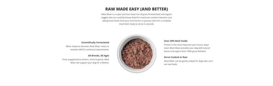
This is the nucleus of your product page. Zones 3 and 4 together answer the two questions that determine whether someone is going to buy.
- Will this actually solve my problem?
- Why is it worth my money?
Most brands either don't answer these questions at all or they answer them like a pamphlet. A feature list, a certification badge, a generic clinically tested claim somewhere near the product description. That approach works okay. But the brands that consistently outperform don't answer these questions like a pamphlet. They answer them like a story.
How to increase conversions with story telling?
You don’t want to write a story about the founder and not a story about the company's journey. You want to tell a story where the main character is the product on the page.
The story arc should go as follows:
- Here is the problem you have
- Here is why that problem exists
- Here is what your life looks like on the other side
- Here is how this product solves it in a way nothing else does
That narrative structure is what separates a compelling mid-page from a list of claims that a visitor scrolls past.
How to sell saturated markets?

If you are trying to figure out how to differentiate in a product category where there are no obvious functional differences between competitors such as supplements, skincare, coffee, or watches look at how the most successful brands in your space structure their mid-page storytelling. The answer is almost never in the ingredients or the formulation alone. It is in identity, aesthetics, values, manufacturing process, origin story of the product, or the specificity of the problem being solved or solving the same problem for a specific type of person within the border niche. Again refer to our opening section CRO Won't Save a Broken Foundation, without a real brand identity it will be hard to build this section without sounding like a pamphlet.
How to Order Proof and Benefits
Benefit blocks before proof. Always. The instinct is to lead with the most impressive thing you have like a dramatic clinical stat, a before/after image. The problem is that a visitor who does not yet understand the product mechanism has no framework to evaluate that proof. They see ‘94% said skin feels soothed’ and think okay, but what is this thing and why would it soothe my skin.
Build the rational case first:
- Explain the product.
- Create desire.
- Then validate it with data.
By the time your visitor sees the clinical numbers, they should already believe the mechanism could work so the proof confirms something they have started to believe rather than asking them to accept something cold.
615ZONE 5: Result-Based Testimonials
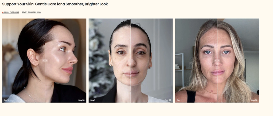
After Zones 3 and 4 have built desire and validated the product, the visitor is close to buying but they have one more question. Not does this product work, you have answered that.
The question is now personal: will it work for someone like me?
This is the specific conversion job of Zone 5. Not generic reviews. Not star ratings. Not vague testimonials that say great product, fast shipping. Result-based testimonials from real customers describing the specific transformation they experienced, in enough detail that a visitor reading it can see themselves in the result.
The difference between a testimonial that converts and one that does not comes down to specificity.
“I love this product”
Tells a visitor nothing.
“I have been dealing with peri-menopausal hair thinning for two years. I was given a box of these from a friend and within the first month my hair stopped falling out, I have never been without NuStrips since”.
This type of testimonial is doing conversion work. It names the specific condition, the timeline, the result, and the emotional outcome. A visitor with the same condition reads that and sees their own solution.
The curation of Zone 5 testimonials is a content strategy, not just a display decision.
You want testimonials that collectively cover the full range of your customer profiles:
- Age
- Skin or hair types
- Severity of the problem being solved
- Timelines to result.
The visitor who takes the longest to convert is the one who cannot find anyone in your social proof that resonates with them. The more diverse your testimonial bank, the fewer invisible conversion barriers you have.
When building your Zone 5 section: curate for specificity not score, a 4-star review that names a specific condition and result is worth ten 5-stars that say love it.
Cover the objection landscape: price, timeline to results, compatibility with specific conditions, long-term use, product format.
Consider adding a short result headline above each testimonial so visitors can scan for their own concern without reading every review in full. Include age and skin or hair context where relevant. A 51-year-old woman reading a testimonial from a 52-year-old with the same skin concern is more likely to convert than the same visitor reading an unattributed review.
616ZONE 6: The Objection FAQ
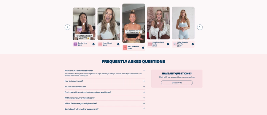
Remove the last friction between want and buy
By the time a visitor reaches Zone 6, they want the product. The zones above have done their job: they are oriented, they trust the brand, they understand the product, they have seen the proof, they have seen people like themselves get the result. The only thing standing between them and adding to cart is a specific, usually small, unanswered question.
Zone 6 is the answer to that question. Not a general FAQ. Not a link to your help center. A carefully built, embedded accordion on the product page itself that answers the specific pre-purchase questions that stop people from clicking ‘Add to Cart’ and nothing else.
How to build FAQs?
The way to build this section is not from your head. It is from your support inbox. Pull the last 30 to 50 pre-purchase customer service queries. Every single question in that inbox is a question a real visitor could not find the answer to on your product page which means every single one is a missed conversion.
Also look at your industry and competitors what questions they answering and reverse engineer those questions into FAQ entries. Put them on the product page. Every answer you add is a leak in your conversion funnel that you have just sealed.
Important tip
Never link out to your help center from a product page FAQ. The moment you send a visitor off the page to find an answer, you have introduced a significant exit risk. Every FAQ answer should be answerable in-page, in-accordion, without requiring a new tab. Answer the uncomfortable questions because the questions brands avoid are almost always the ones blocking the most sales. And match the FAQ tone to the brand voice. The FAQ is not a legal document. It is a conversation at the point of purchase and it should sound like the rest of your brand.
617ZONE 7: The Review Section
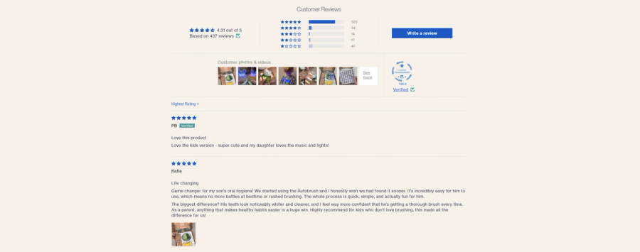
The final seal, general reviews for visitors who need one more layer
Zone 7 is the general star-rated review section at the bottom of the page. It is the last zone because it serves the last type of visitor: the one who has read everything, wants the product, but needs the comfort of seeing the full review landscape, not just the curated highlights, before they buy.
The distinction between Zone 5 and Zone 7 is important. Zone 5 is curated for conversion with specific outcomes, specific customer profiles, selected to address the primary objections. Zone 7 is the full review body of star distribution, recent reviews, the volume and variety that tells a visitor thousands of real people bought this, here is the unfiltered picture.
Zone 7 is also where the visitor who jumped straight to reviews from the hero zone will land. This visitor needs to see volume, recency, and a good star distribution. They are not looking for a specific result; they are doing a final sanity check.
Display star distribution prominently with the percentage breakdown of 1-star through 5-star as this is more credible than an aggregate score alone. Make reviews scannable with filtering by rating, concern, skin or hair type, or keyword. And keep recency visible. A review section where the most recent entry is 18 months old signals that the product's momentum has stalled. If your recent review volume is low, make it easier for post-purchase customers to leave reviews before Zone 7 becomes a conversion liability.
Build the page your product deserves

The seven zones in this framework are not seven things to add to your product page. They are seven jobs that your product page already needs to do. Question whether your current layout is doing those jobs, in the right sequence, for a visitor who has never heard of your brand and has ten other tabs open.
The brands in this guide do not have product pages that convert because they have more features or bigger budgets. They have product pages that convert because every layout decision was made with the customer's psychology in mind. The first image leads with credibility because that is the question a cold visitor has before they read anything. The UGC carousel precedes the brand copy because a stranger's voice is more persuasive than your own. The benefit blocks precede the clinical stats because desire has to exist before proof can confirm it. The FAQ answers the uncomfortable questions because those are the ones actually blocking sales.
The sequence is not theory. It is a mirror of how a real person moves from uncertainty to commitment. Build your product page in that sequence, and the page itself becomes the best salesperson your brand has.
Every element on your product page has one job: serve the visitor who arrived 30 seconds ago and has never heard of your brand. If it is not serving that visitor at the moment they encounter it, it is not earning a sale.
Frequently Asked Questions
What is CRO in ecommerce?+
What is a good conversion rate for a DTC product page?+
How do I increase sales on my Shopify store?+
What should a product page include?+
Why is my product page not converting?+
How do I write product page copy that converts?+
What is above the fold on a product page?+
How do I use social proof on a product page?+
How important are product page images for conversion?+
What is the difference between features and benefits in product copy?+
See How Your Product Page Stacks Up
Get a free audit and benchmark your product page against the highest converting pages in your industry to see exactly where you stand.