Shopify Visitors Not Buying? Fix These 7 Things First
Before you touch your ads, your email flows, or your CRO stack. Fix these seven things on your product page and watch your conversion rate move.

Turn Visitors Into Sales
Your needs a system that turns visitors into buyers. Our Shopify Conversion System shows you exactly how to fix what’s stopping people from purchasing and start getting consistent sales from the traffic you already have.
In a previous article we went over the 7 zones that make or break your product page. If you have not read that yet, start there first. This article builds directly on top of it.
This article takes those 7 zones and breaks down the most common mistakes brands make in each one. For every mistake we tell you exactly what it is, why it is costing you conversions, and what to do about it. By the end you will have a clear action list of fixes you can start implementing on your store today without a developer, without an agency, and without spending more on ads.
011. Your above the fold section is not answering the right questions
The first thing a visitor sees before they scroll is your hero zone. This section has one job: answer five questions every cold visitor needs answered before they will scroll further.
- What is this product?
- Is it legitimate?
- What does it do for me?
- What does it cost and is it worth it?
- What happens if it does not work?
Most stores answer one or two of these and call it done. The stores converting at 4% and above answer all five before the visitor moves a single finger.
Check your above the fold right now on mobile. That is where the majority of your traffic is landing. Ask yourself honestly whether a person who has never heard of your brand could answer all five questions from what they see in the first three seconds. If they cannot, that is your biggest conversion leak and the first thing to fix.
How to fix it
Your hero zone needs all of the following visible before the visitor scrolls on mobile:
- Product name
- Credibility signal such as review count, award, or media logo
- One-line outcome-focused benefit
- Clear price with context such as a strikethrough, tier, or per-use breakdown
- Visible risk reversal such as a guarantee or free returns
You need to have great photos
Your product photography. Buyers in 2025 are sharp. They know what a Temu product looks like. They know what an AI generated lifestyle image looks like. If your photos look cheap, generic, or like something they could find for half the price on Amazon they will leave before they read a single word of your copy. Bad photography damages the first impression before your copy even gets a chance to work. If you are dropshipping or in a competitive category, high quality original product photography is not optional. It is the foundation your entire above the fold is built on.
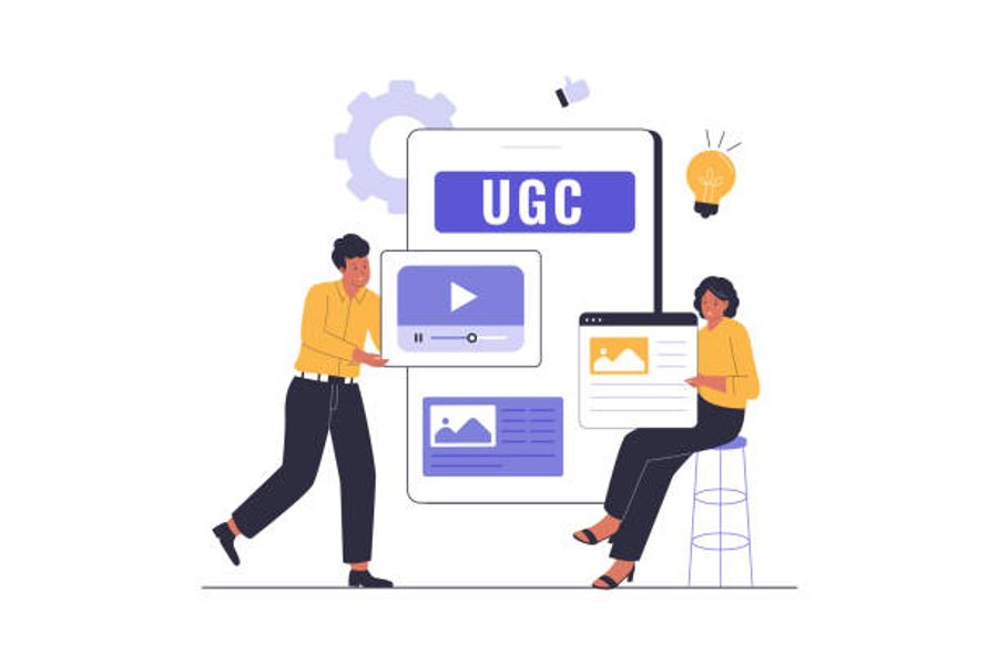
022. You have no social proof after your hero zone
Anyone can build a Shopify store in a weekend and call themselves a brand. Buyers know this. They have been burned before and they are skeptical by default. Nobody buys from a brand they do not trust and trust is not built by telling people you are legitimate. It is built by showing them.
Most stores stack all their reviews at the bottom of the page where only the already-converted visitor goes to confirm a decision they have already made. The visitor who needs the most convincing never scrolls that far. By the time a cold visitor finishes reading your hero zone they have one question. Is this brand real and does it actually work? If the next thing they see does not answer that question you are losing them at the highest drop-off point on the page.
You need to add a social proof section as close to your hero zone as possible. This sets the stage for everything that follows. Heatmap and session recording data from client stores consistently shows the same pattern: visitors land on the product page, scroll down to the social proof section, then immediately scroll back up and add to cart. The social proof section is often the deciding moment and most brands either do not have it or have it buried too far down the page.
How to fix it
Directly after your hero zone add one of the following:
- A horizontal carousel of at least five real customers holding and reviewing your product
- A grid of authentic customer before and after photos with real context and captions
- A volume signal such as 10,000 customers served or 80,000 routines sold paired with real customer photo results
A few things that will make this section work harder:
- Use real customers not paid creators or ad-based UGC
- Label it clearly as real customer reviews not paid content
- Show customers actually holding or using the product not just talking to camera
- Natural lighting and authentic settings outperform polished production at this stage
- More is generally better until it becomes overwhelming, five is the minimum
Why real customer UGC outperforms paid creator content here
When you label this section as real customer reviews and not paid creators it adds an extra layer of credibility that paid UGC cannot replicate. Visitors know the difference. A real customer who bought the product and filmed themselves using it carries more weight than a creator who was sent it for free. If you have both lead with the real customers.
What makes social proof actually convert
Not all social proof is equal. The formats that convert best share three things:
- They are specific. A customer naming their exact problem and exact result converts better than a five star review that says great product
- They are visual. Video and photo proof outperforms text reviews at this stage because it is harder to fake and easier to believe
- They are diverse. Showing results across different ages, skin types, body types, or use cases removes the invisible objection of will this work for someone like me
What does not work here
A row of media logos. Press logos belong further down the page in your proof section. At this stage the visitor needs to see real people not institutions. If your only social proof is a Forbes mention and a podcast appearance you have not yet earned the trust you need to sell to a cold visitor.
3. Your product page has no visual hierarchy

Most product descriptions list features. What the product contains, what it is made from, how big it is, what certifications it has. Visitors do not buy features. They buy outcomes.
The brands converting above their category average write their mid-page copy as a story where the product is the hero. The arc is always the same. Here is the problem you have. Here is why that problem exists. Here is what your life looks like after this product solves it. Here is why nothing else solves it the same way.
A visitor reading a feature list is evaluating. A visitor reading a story is imagining. Imagining is the mental state that precedes buying.
The copy problem and the layout problem are the same problem
Even if your copy tells a compelling story, if the page looks like a wall of text broken up by random bullet points your visitor will not read it. Most Shopify product pages have one of two problems. Either they are a dense block of copy with no visual breathing room that feels exhausting to read. Or they are a loose collection of bullet points with no narrative thread connecting them that feels like a product catalogue rather than a brand.
Neither converts well. The page needs both good copy and good structure working together.
How to structure a mid-page that actually gets read
Think of your mid-page as a series of sections, each with one job, each visually distinct from the one before it. A visitor scanning your page on mobile should be able to understand the story you are telling just from the section headers and visual elements alone without reading a single paragraph. The copy is for the visitor who wants to go deeper. The visual structure is for everyone.
A well structured mid-page looks like this:
- A benefit headline that states the outcome in one line
- Two to three sentences of body copy that explain the mechanism in plain language
- A supporting visual such as a product in use, an ingredient callout, or a before and after
- A transition into the next section that connects the story forward
Each section should feel like a natural progression. Not a new topic but the next chapter of the same story.
Visual hierarchy is not decoration it is conversion infrastructure
Visual hierarchy is the system that tells a visitor's eye where to look first, second, and third. Without it every element on the page competes for attention equally and the visitor's eye does not know where to go. With it you control the reading journey and guide the visitor through the exact sequence of information that builds desire and removes objection.
The basics of visual hierarchy on a product page:
- Headlines larger than body copy, benefit focused not clever
- Subheadings that can be read in isolation and still communicate value
- White space between sections so the page breathes and does not feel cluttered
- Images that show the product in context not just floating on a white background
- Bold used sparingly for genuinely important information not for decoration
- Expandable accordions for detailed information like full ingredient lists, certifications, and shipping policy so the page does not feel overwhelming to a first time visitor
The balance between copy and visual elements
A page that is all copy feels like homework. A page that is all visuals with minimal copy feels like a lookbook. The pages that convert at the highest rates balance both. Lead with visuals to create desire then support with copy to build the rational case then use visuals again to provide proof then close with copy that removes the final objection.
The rule of thumb is that no section of body copy should run longer than three to four sentences before a visual element, a subheading, or a layout change gives the eye a place to rest. If you are writing longer than that you are writing for a reader not a buyer and on a product page those are two different people.
How to fix it
Rewrite your product description to lead with the transformation not the formula:
- Open with the specific problem your customer has right now in language they would use themselves
- Explain what your product does about it in plain language without jargon
- Show what the customer's life looks like on the other side of that problem being solved
- Then explain why your product solves it in a way nothing else does
- Save the full ingredient list, certifications, and technical specifications for expandable accordion sections lower on the page
Then look at the layout of every section and ask two questions. Can a visitor scanning on mobile understand the point of this section without reading the body copy? And does this section connect naturally to the one that follows it? If the answer to either is no the section needs restructuring before it needs rewriting.
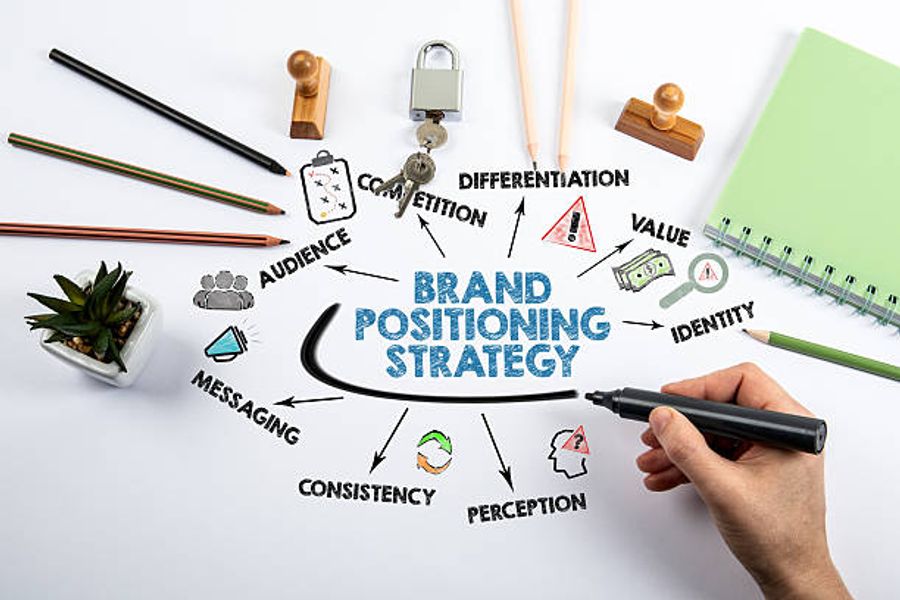
034. You have no brand identity
Features can be copied. Price can be matched. A brand identity cannot be replicated.
The stores that consistently convert above their category average are not just selling a product. They are selling a specific point of view, a specific person, and a specific promise that no competitor can copy because it is uniquely theirs. Your brand identity is the backbone of every word of copy on your product page. Without it you sound like everyone else in your category and when you sound like everyone else the visitor has no reason to buy from you over the next option.
Brand identity is not your logo or your colour palette. It is the specific answer to one question: why would someone buy this from you and not from the ten other stores selling something similar?
The answer could be:
- Who you made it for. A supplement brand that speaks exclusively to perimenopausal women converts better with that audience than a generic wellness brand trying to speak to everyone
- What you stand for. A skincare brand that bans 2,100 harmful ingredients and publishes every formulation decision has a position. A skincare brand that says clean and natural does not
- How it is made. A founder who spent 15 years at Chanel research labs formulating the product is a story. A product that was made at a third party lab with no named expertise is not
- The specific problem you solve. A product that solves intimate skin irritation for women who shave has a specific identity. A general sensitive skin product does not
Real examples of identity creating an edge in saturated markets
We work with a dropshipping client selling knee pain straps. One of the most saturated product categories you can enter. Every competitor is selling the same product with the same generic copy targeting the same broad audience. Instead of competing head to head our client built their entire brand around a specific type of person experiencing a specific type of pain. Their copy, their imagery, their testimonials, and their product page all speak directly to that one person. Their conversion rate outperforms every generic competitor in the category because the right visitor lands on the page and immediately thinks this is made for me.
We also work with a red light therapy company that made a completely different identity decision. Rather than competing in the crowded consumer market where every brand is fighting for the same health and wellness buyer, they repositioned the entire brand around B2B sales to clinics and practitioners. Their product page, their copy, and their trust signals all speak to a clinic owner evaluating equipment for their practice rather than a consumer browsing wellness products. Same product. Completely different identity. And a market with far less competition and far higher average order values.
Neither of these required a product change. Both required a clear decision about who they were for and the discipline to build the entire page around that one person.
How this shows up on your product page
Your brand identity should be visible in every section of the page. The tone of your copy. The way you write your FAQ. The story in your mid-page content blocks. The language your customer testimonials use. When your identity is clear everything on the page reinforces it. When it is not clear the page reads like a generic product listing and converts like one too.
How to fix it
Answer these questions before you rewrite a single word of your product page:
- Who specifically is this product for
- What is the one problem it solves better than anything else
- What makes the way it solves that problem different from every competitor
- What do you stand for that a competitor cannot credibly claim
Once you have clear answers to all four your product page copy writes itself. Every section becomes a different way of expressing the same identity rather than a disconnected list of features and claims.
The test
Read your current product page and ask: could a competitor copy and paste this description onto their own page and have it still make sense? If the answer is yes you do not have a brand identity on the page yet. You have a product listing.
5. You are devaluing your brand
Countdown timers. Sales popups. Buy more get 30% off banners. Limited time offer ribbons on every product. Flash sale messaging that has been running for six months straight.
This is the fastest way to tell a visitor that your product is not worth full price.
When a store is covered in discount signals and urgency triggers the visitor does not think wow I better buy now. They think this brand is desperate. And desperate brands do not have products worth paying full price for. You are not creating urgency. You are training your customers to wait for a sale and attracting the type of buyer who will leave the moment they find a cheaper alternative on Amazon.
The brands that command premium prices and loyal customers do the opposite. They compete on product quality, brand identity, and perceived value. They do not need to discount because their page makes the case that the product is genuinely worth what it costs. When you do run a promotion it means something because you are not running one every other week.
What over-discounting actually costs you
- It attracts price-driven buyers who have no loyalty to your brand
- It trains your existing customers to never pay full price
- It signals to new visitors that the original price was not real
- It makes every future promotion feel less urgent because visitors have learned to wait
- It devalues the brand you are trying to build every single day it runs
What to do instead
Compete on value not price. Your product page should make such a strong case for why the product is worth what it costs that the visitor feels the price is justified without needing a discount to get there. That means a strong hero zone that communicates quality immediately, mid-page copy that builds the rational case for the price, social proof that shows real people getting real results at full price, and a brand identity that gives the visitor a reason to choose you over a cheaper alternative.
If you want to use bundles and tiered pricing do it as a value add not a desperation move. A bundle that packages two complementary products together at a slight saving makes sense because it increases the value the customer gets. A buy more get 30% off banner plastered across your homepage tells the visitor you are struggling to move stock.
The difference between a brand that commands a premium and a brand that is always on sale is not the product. It is the confidence the page communicates about the product's worth.
6. You have not researched your competitors or your niche
Most brands build their product page in a vacuum. They write copy based on what they think sounds good, price based on what feels right, and structure their page based on what they have seen other stores do without ever sitting down and systematically studying what is actually working in their specific category right now.
This is one of the most expensive mistakes a store owner can make and it is almost entirely avoidable.
Your competitors have already done years of testing for you. The brands winning in your category have spent real money figuring out what messaging converts, what price points the market accepts, what objections buyers have, what social proof formats work, and how to structure a product page that sells. All of that information is sitting on their website right now available for free. Most store owners never look at it properly.
Who your real competitors are
Before you start researching, get clear on who you are actually competing with. Your competitors are not Nike. They are not a nine figure national brand with a Super Bowl ad budget and twenty years of brand equity. Your real competitors are the brands doing around $300K to $3M a year in your category. The seven figure DTC stores that are running paid ads, have a real product page, and are actively competing for the same customer you are trying to reach.
These are the brands worth studying because they are operating in the same constraints you are. Similar budgets, similar team sizes, similar traffic sources. What is working for them is far more applicable to your situation than anything a hundred million dollar brand is doing. Find five to ten of them in your category and study them properly.
What proper competitor research actually looks like
It is not a five minute browse of a competitor's homepage. It is a systematic breakdown of everything they are doing and why.
- Read every word of their product page copy and identify what problem they are leading with and what transformation they are promising
- Note where they place their social proof, what format it is in, and what specific results their testimonials highlight
- Look at their pricing structure and how they frame the value of that price
- Read every review on their page and on third party sites like Amazon and identify the exact language customers use to describe the problem the product solved
- Look at their FAQ and identify what objections they are addressing
- Check how long they have been running the same page structure using tools like the Wayback Machine as a page that has not changed in two years is almost certainly converting well
The review mining method
One of the most powerful research techniques available to any store owner costs nothing and takes two hours. Go to Amazon and find the top selling products in your category. Read the one, two, and three star reviews. These reviews tell you exactly what the market wants that existing products are failing to deliver. That gap is where your messaging lives.
Then read the five star reviews and write down every phrase customers use to describe the result they got. These are not your words. They are your customer's words. And your customer's words will always convert better than anything a copywriter can invent because they are the exact language the next buyer is using to describe the problem they want solved.
Research your competitors to understand where you stand
Studying your competitors is not just about improving your product page. It is about understanding the landscape of DTC in your category and knowing exactly where you currently sit in the pecking order. Which brands are ahead of you and why. Which ones are at a similar stage. Which ones are behind you and what mistakes they are making that you can avoid.
This gives you something most store owners never have: a realistic picture of what it actually takes to compete and win in your specific category. You can set better goals, make smarter positioning decisions, and stop comparing yourself to brands operating at a completely different scale with completely different resources. Understanding the competitive landscape means you stop guessing where you stand and start making strategic decisions based on what you can actually see.
What to look at beyond your direct competitors
Look at brands competing in adjacent saturated markets too. Supplements, skincare, coffee, and watches are categories where identity and positioning have been stress tested at scale. Even if you are not in those categories, the way the top brands in those spaces differentiate themselves through story, specificity, and perceived value is directly applicable to whatever you are selling.
How to apply what you find
You are not looking to copy competitors. You are looking to understand the market well enough to position yourself clearly within it. After proper competitor research you should be able to answer:
- What is the standard price point the market accepts and what does a brand need to demonstrate to charge above it
- What are the top three objections buyers in this category have that your page needs to address
- What messaging angles are already saturated and what angles are underused
- What does the best converting page structure in your category look like and why
If you cannot answer all four of those questions you have not done enough research yet. Go back and look harder. The brands winning in your category already know all of this. Until you do you are competing blind.
047. You have no structured way to know what is actually wrong

Everything above is a common problem but it may not be your specific problem. Your conversion leak could be on mobile only. It could be specific to one traffic source. It could be a single confusing section that visitors keep abandoning at. Without the right tools you are fixing things based on instinct rather than data and instinct is expensive when it is wrong.
The good news is that the minimum viable CRO setup costs as little as $19 per month and will show you more about your conversion problem in one week of consistent use than most agencies will tell you in a full audit.
The three tools you need and what each one does
Tool 1: Analytics — what is happening
Google Analytics 4 or Shopify Analytics tells you what is happening on your store in numbers. Which pages visitors land on, where they drop off, what your conversion rate is by traffic source, and where in the funnel you are losing the most people.
What to track and monitor:
- Conversion rate by traffic source so you know whether paid social, email, and organic are converting differently
- Landing page drop-off rate to identify which pages are losing the most visitors
- Add to cart rate versus purchase rate to see how many people get close but do not complete
- Mobile versus desktop conversion rate separately as these are almost always different and often require different fixes
- Sessions to checkout to purchase funnel to pinpoint exactly which step is losing the most people
Cost: Free
Tool 2: Behavior analytics — why it is happening
Session recording tools like Microsoft Clarity or Lucky Orange show you what visitors are actually doing on the pages your analytics has flagged as problems. You stop looking at numbers and start watching people. This is where you find out whether visitors are scrolling past your price without reading the guarantee, whether your add to cart button is below the fold on mobile, or whether a specific section is causing visitors to hesitate and leave.
What to track and monitor:
- Session recordings of visitors who spent more than two minutes on your product page without converting — these are high intent visitors who almost bought
- Session recordings filtered by mobile only as mobile behaviour is almost always different from desktop
- Heatmaps on your product page to see which sections get the most attention and which get ignored completely
- Scroll maps to see how far down the page the average visitor gets before leaving
- Rage clicks which indicate a visitor repeatedly clicking something that is not working or not clickable
- Recordings segmented by traffic source to see whether paid social visitors behave differently to email or organic visitors on the same page
Cost: Microsoft Clarity is completely free with unlimited recordings. Lucky Orange starts at $19 per month with Shopify-specific funnel tracking built in.
Tool 3: Retention — recovering visitors who almost bought
Klaviyo handles the visitors who were close to buying but did not complete the purchase. A visitor who adds to cart and leaves is the highest intent visitor your store will ever have. They chose your product. Something small stopped them. A well built abandoned cart flow brings a meaningful percentage of those visitors back automatically.
What to set up and monitor:
- Abandoned cart flow: three emails sent one hour, twenty-four hours, and seventy-two hours after abandonment
- Abandoned checkout flow: separate from cart abandonment, targeting visitors who started checkout and stopped
- Browse abandonment flow: for visitors who viewed a product page multiple times without adding to cart
- Revenue per recipient for each flow so you know exactly how much each automated sequence is generating
- Unsubscribe rate per flow to identify if any email is damaging your list
Cost: Free up to 250 contacts. From $20 per month as your list grows.
How to use these three tools together
The three tools work as a system not in isolation. Analytics tells you which page has the problem. Behaviour tools show you what the problem looks like. Klaviyo recovers the revenue while you fix it.
The workflow looks like this:
- Open GA4 and find the page with the highest drop-off rate or lowest add to cart rate
- Open Microsoft Clarity or Lucky Orange and filter session recordings for that specific page
- Filter further for visitors who spent more than two minutes without converting
- Watch ten recordings and note what the majority of visitors have in common before they leave
- That pattern is your hypothesis for what to fix
- Make one change based on what you saw
- Check the recordings again after two weeks to see if the behaviour has changed
While you are doing all of this Klaviyo is running in the background recovering abandoned carts and bringing high intent visitors back to complete their purchase.
Where to start today
Install Microsoft Clarity right now. It is free, takes five minutes, and starts recording sessions immediately. You do not need to configure anything. Just install it and let it run for a week. Then come back, filter for visitors who spent more than two minutes on your product page without converting, and watch ten recordings.
By the end of those ten recordings you will know exactly which of the seven problems in this article is your biggest conversion leak and exactly where to focus first.
None of the seven mistakes on this list require a bigger ad budget, a new product, or an agency retainer. They require attention. Attention to what your visitor sees first, what they doubt, what they need to believe before they buy, and what is quietly stopping them at every stage of the page. Fix the attention problem and the conversion problem fixes itself.
Frequently Asked Questions
What is a good ecommerce conversion rate in 2026?+
Why is my product page getting traffic but not converting?+
How many product images do I need on a product page?+
Does social proof actually improve conversion rates?+
What is the biggest cause of cart abandonment in ecommerce?+
How does page speed affect ecommerce conversion rates?+
What free tools can I use to improve my product page conversion rate?+
Is discounting a good strategy to improve ecommerce conversions?+
How important is mobile optimization for ecommerce conversion in 2026?+
How do I find out what is wrong with my product page without hiring an agency?+
Fix Your Shopify Conversion Problem
If your store is getting traffic but not sales, the problem isn’t more visitors, it’s what happens after they land. We'll give you a system that shows you exactly how to turn the traffic you already have into paying customers without guessing or rebuilding everything. If you’re ready to fix what’s actually stopping your sales, get the system now and start converting your visitors into buyers.